Context
Rizaldy Art is a Philippines-based visual artist who needed one place on the internet that did two jobs at once: showcase the work convincingly, and let an interested client book an appointment without leaving the page.
For a working artist, the gap between "someone liked my portfolio" and "someone booked me" is usually measured in lost leads. Most artist sites split into two surfaces — a portfolio on one domain or platform, and a scheduling tool somewhere else — and that handoff is where momentum dies. Prospects don't follow through two tabs and an email chain; they close the browser.
The Challenge
Three constraints that shaped every decision:
- Artist sites usually split into "portfolio" and "contact" — losing leads at the handoff. Any solution that required a tab switch to book was the wrong answer.
- The work had to carry the page visually. The layout couldn't compete with the art. That meant ruthless restraint on typography, whitespace, chrome, and color. Every design decision got evaluated against a single question: does this serve the work, or distract from it?
- Booking had to feel native, not like a bolted-on third-party widget. A standard "embed this iframe" scheduling widget reads as third-party the second it loads — different font, different spacing, different visual language. On an artist's portfolio, that break is louder than the work itself.
The failure mode I was designing against: a site that looks good in a portfolio review but quietly hemorrhages the leads that actually matter commercially.
Approach
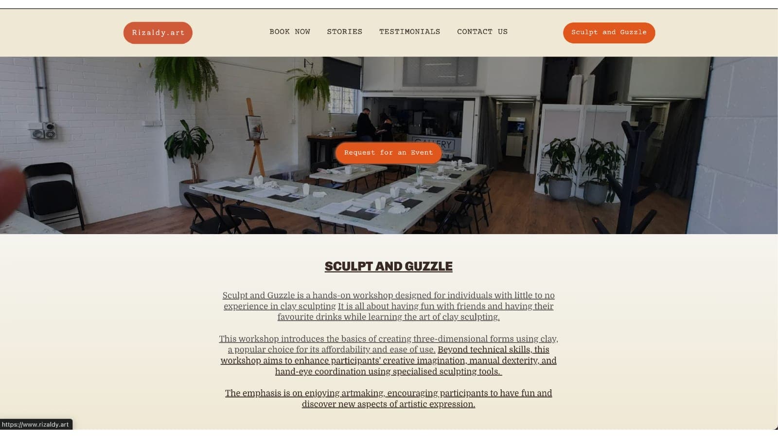
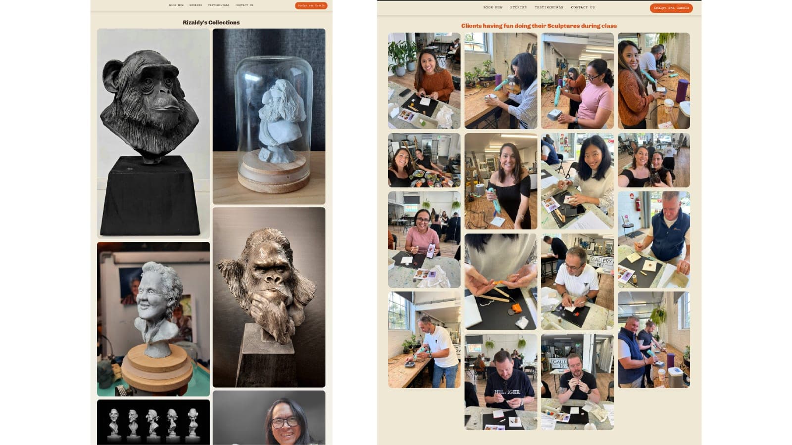
I let the work lead. The site is structured gallery-first with typography and whitespace that step back, and the booking flow sits inline so the viewer never has to leave the page or context.
Decisions:
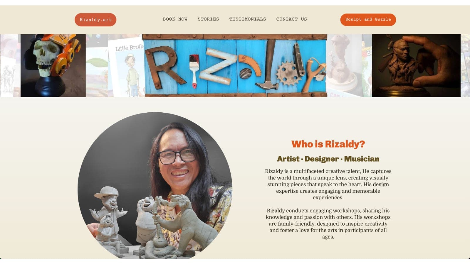
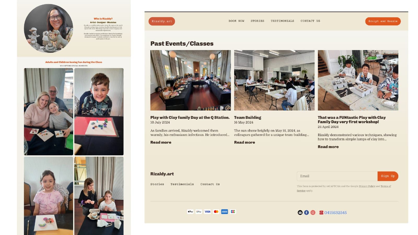
- Gallery-first information architecture. The first thing a visitor sees is the work, not a bio. Every subsequent section was evaluated for whether it reinforced the work or competed with it.
- Typography as scaffolding, not decoration. Minimal type system with aggressive restraint — a single display face and a single body face, no ornamentation, no curated "brand personality" competing with the images.
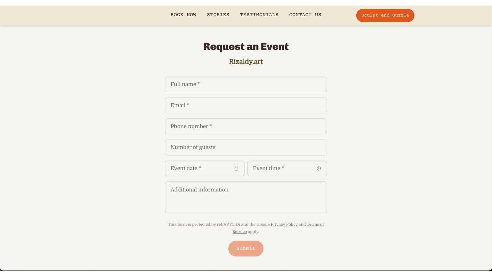
- Inline booking surface. The appointment flow lives on the same page as the portfolio, not a modal, not a separate route. A visitor decides to book without context-switching.
- Mobile-first layout. Most artist-portfolio traffic comes through phone browsers — Instagram referrals, messaging-app links, photo-saved-then-visited patterns. Desktop layout followed mobile, not the other way around.
What I Built
- Gallery-first layout — images at the center of every view, minimal chrome, typography that functions as scaffolding rather than decoration.
- Inline appointment booking — no tab-switching, no external widget. The booking flow is part of the page, styled to match.
- Responsive across devices — mobile phones through large displays, with image sizing tuned per breakpoint so the work loads crisply at every viewport.
- Performance-tuned image delivery — galleries that load fast without sacrificing resolution. Format selection, lazy loading, and ordering all tuned so the first images appear immediately and the deeper gallery fills in as the visitor scrolls.
The underlying principle: every technical decision served one job, which was to shorten the distance between "this artist's work moved me" and "I've booked an appointment." The site is a conversion surface dressed as a portfolio.
Timeline
Engagement ran through 2024. The shape:
- Discovery. Cataloged the existing work, identified the images that deserved hero placement, and mapped the booking flow against the actual decisions a prospective client makes when commissioning an artist.
- Architecture and design. Gallery structure, booking flow, typography system, palette. All decided before any code got written — so the build phase wouldn't generate design decisions mid-stream.
- Build and polish. Frontend build, image delivery tuning, booking integration, responsive passes.
- Launch. Site live with portfolio and booking running on one surface.
Outcome
- Launched with portfolio and booking live in one place — no external scheduler, no handoff break.
- Single surface for artistic showcase and client intake. The visitor never has to leave the context of the work to take the next step.
- Cohesive identity — typography, layout, and booking flow all feel like the same brand. No third-party visual intrusion.
What I'd repeat
The pattern that made this ship cleanly was treating the booking flow as a first-class part of the design system, not a feature added later. Most portfolio-plus-booking builds slip because the portfolio gets treated as the "real" site and the booking gets treated as plumbing. For a working artist, the booking flow is the product. The portfolio is how prospects find their way to it. Designing in that order — booking first, portfolio as the approach path — is what keeps the site commercial instead of decorative.
Screens from the build